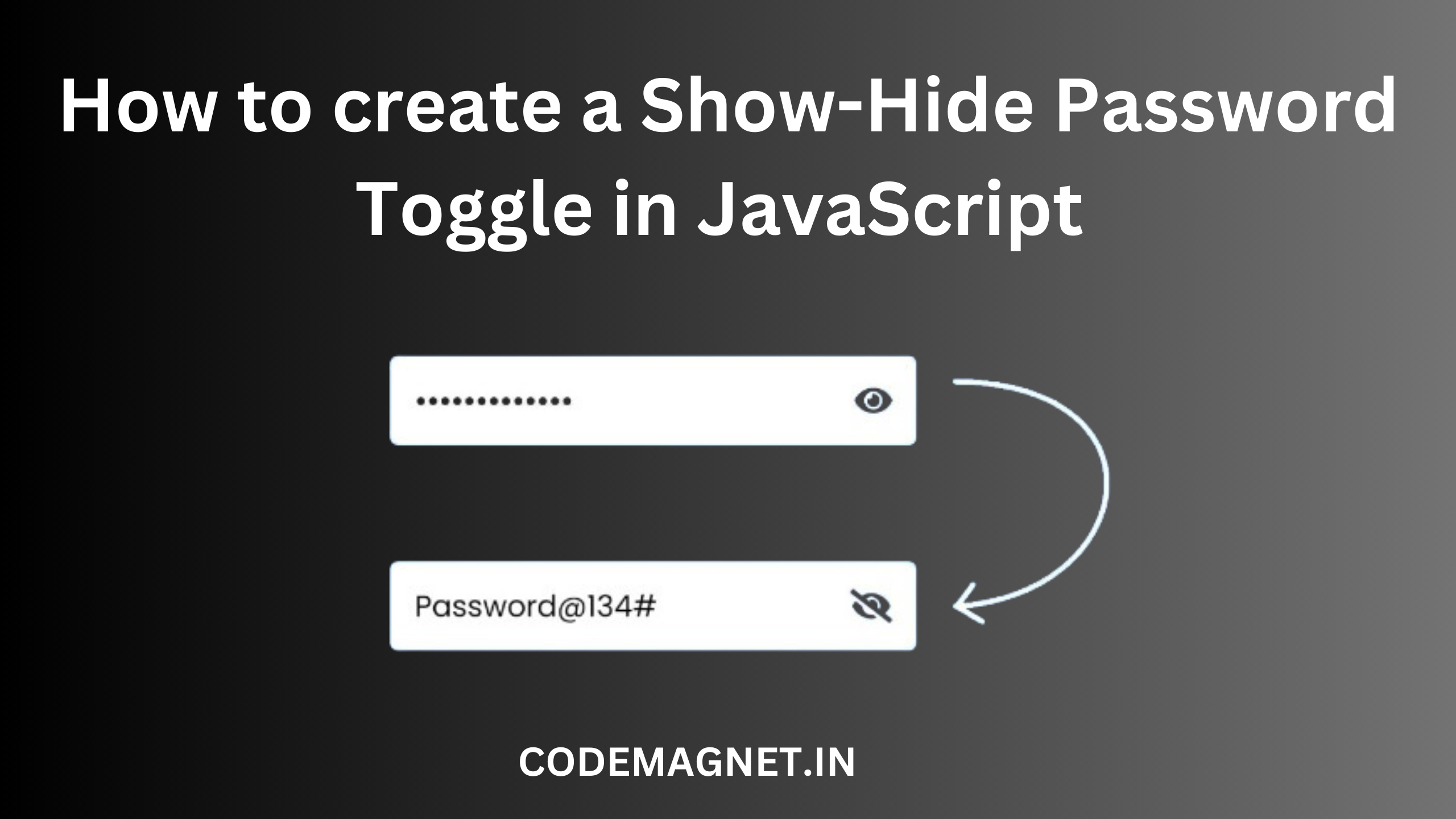
Are you looking to implement a “Show/Hide Password” feature using JavaScript? This article will guide you through creating the eye icon functionality for toggling password visibility, commonly found in login or registration forms. Learn how to enhance user experience by allowing them to easily show or hide their password after input.
Displaying and concealing passwords in web applications is a frequent necessity for websites with user accounts or login systems. Achieving this functionality can be done through JavaScript and HTML.
The basic approach to toggling password visibility in JavaScript involves using two buttons. One button reveals the password, while the other hides it. To implement this, you can assign an event listener to each button that toggles the type attribute of the password input field.
Here’s an example demonstrating how you can show and hide a password using JavaScript:
<!DOCTYPE html>
<html>
<head>
  <title>Show/Hide Password Toggle</title>
  <link rel="stylesheet" href="b1.css">
    <link rel="stylesheet" href="https://cdnjs.cloudflare.com/ajax/libs/font-awesome/4.7.0/css/font-awesome.min.css">
</head>
<body>
  <div class="wrapper">
    <input type="Password" placeholder="Password" id="password">
    <span>
      <i class="fa fa-eye" aria-hidden="true" id="eye" onclick="toggle()"></i>
    </span>
  </div>
</body>
</html>
Code Explanation:
<!DOCTYPE html>: This is the document type declaration, which tells the browser that this is an HTML5 document.<html>: The opening tag for the HTML document.<head>: Contains meta-information about the HTML document, such as the title and links to external resources.<title>Show/Hide Password Toggle</title>: Sets the title of the HTML document to “Show/Hide Password Toggle”.<link rel="stylesheet" href="b1.css">: Links an external CSS file named “b1.css” to style the HTML document.<link rel="stylesheet" href="https://cdnjs.cloudflare.com/ajax/libs/font-awesome/4.7.0/css/font-awesome.min.css">: Links an external CSS file from the Font Awesome library to use icons in the document.</head>: Closes the head section of the HTML document.<body>: Contains the content of the HTML document that is visible to the user.<div class="wrapper">: Defines a container with the class “wrapper” to hold the password input field and the eye icon.<input type="Password" placeholder="Password" id="password">: Creates a password input field with the placeholder text “Password” and assigns it an ID of “password”.<span>: Defines an inline container to hold the eye icon.<i class="fa fa-eye" aria-hidden="true" id="eye" onclick="toggle()"></i>: Creates an icon with the Font Awesome class “fa fa-eye” to represent the eye icon. The icon has an ID of “eye” and an onclick event that calls the “toggle()” function when clicked.</span>: Closes the span tag.</div>: Closes the div tag.</body>: Closes the body tag.</html>: Closes the html tag.
CSS:
body{
  background-color: #5887ef;
  padding: 0;
  margin: 0;
}
.wrapper{
  position: absolute;
  transform: translate(-50%,-50%);
  top: 50%;
  left: 50%;
  width: 300px;
}
input{
  box-sizing: border-box;
  width: 100%;
  font-size: 18px;
  border: none;
  padding: 10px 10px;
  border-radius: 3px;
  font-family: 'Poppins',sans-serif;
  color: #4a4a4a;
  letter-spacing: 0.5px;
  box-shadow: 0 5px 30px rgba(22,89,233,0.4);
}
::placeholder{
  color: #9a9a9a;
  font-weight: 400;
}
span{
  position: absolute;
  right: 15px;
  transform: translate(0,-50%);
  top: 50%;
  cursor: pointer;
}
.fa{
  font-size: 20px;
  color: #7a797e;
}
Code Explanation:
body {: This selector targets the body element of the HTML document.background-color: #5887ef;: Sets the background color of the body to a shade of blue (#5887ef).padding: 0;: Removes any padding inside the body element.margin: 0;: Removes any margin around the body element.}: Closes the body selector..wrapper {: This selector targets elements with the class “wrapper”.position: absolute;: Sets the position of the element to absolute, allowing for precise placement.transform: translate(-50%,-50%);: Uses the transform property to center the element horizontally and vertically.top: 50%;: Sets the top position of the element to 50% of the containing element’s height.left: 50%;: Sets the left position of the element to 50% of the containing element’s width.width: 300px;: Sets the width of the element to 300 pixels.}: Closes the .wrapper selector.input {: This selector targets input elements.box-sizing: border-box;: Ensures that the padding and border are included in the element’s total width and height.width: 100%;: Sets the width of the input element to 100% of its containing element.font-size: 18px;: Sets the font size of the text inside the input element to 18 pixels.border: none;: Removes the border around the input element.padding: 10px 10px;: Sets the padding inside the input element to 10 pixels on the top and bottom, and 10 pixels on the left and right.border-radius: 3px;: Sets the border radius of the input element to 3 pixels, giving it rounded corners.font-family: 'Poppins',sans-serif;: Sets the font family of the text inside the input element to ‘Poppins’, with a fallback to the sans-serif font family.color: #4a4a4a;: Sets the color of the text inside the input element to a dark gray (#4a4a4a).letter-spacing: 0.5px;: Sets the spacing between characters in the text inside the input element to 0.5 pixels.box-shadow: 0 5px 30px rgba(22,89,233,0.4);: Adds a box shadow to the input element with a horizontal offset of 0 pixels, a vertical offset of 5 pixels, a blur radius of 30 pixels, and a color of rgba(22,89,233,0.4).}: Closes the input selector.::placeholder {: This selector targets the placeholder text inside input elements.color: #9a9a9a;: Sets the color of the placeholder text to a light gray (#9a9a9a).font-weight: 400;: Sets the font weight of the placeholder text to 400, which is normal.}: Closes the ::placeholder selector.span {: This selector targets span elements.position: absolute;: Sets the position of the element to absolute, allowing for precise placement.right: 15px;: Sets the right position of the element to 15 pixels from the right edge of its containing element.transform: translate(0,-50%);: Uses the transform property to vertically center the element.top: 50%;: Sets the top position of the element to 50% of the containing element’s height.cursor: pointer;: Changes the cursor to a pointer when hovering over the element, indicating it is clickable.}: Closes the span selector..fa {: This selector targets elements with the class “fa”.font-size: 20px;: Sets the font size of the icon to 20 pixels.color: #7a797e;: Sets the color of the icon to a light gray (#7a797e).}: Closes the .fa selector.
JavaScript:
<script>
    var state= false;
    function toggle(){
      if(state){
        document.getElementById("password").setAttribute("type","password");
        document.getElementById("eye").style.color='#7a797e';
        state = false;
      }
      else{
        document.getElementById("password").setAttribute("type","text");
        document.getElementById("eye").style.color='#5887ef';
        state = true;
      }
    }
  </script>
var state = false;: This line declares a variablestateand initializes it tofalse. This variable is used to track the current state of the password field (whether it is visible or hidden).function toggle() {: This line defines thetoggle()function, which will be called when the eye icon is clicked.if (state) {: This line checks if thestatevariable istrue, indicating that the password field is currently visible.document.getElementById("password").setAttribute("type", "password");: If thestateistrue, this line sets thetypeattribute of the password field (identified by its ID “password”) to “password”, which hides the password characters.document.getElementById("eye").style.color = '#7a797e';: This line changes the color of the eye icon (identified by its ID “eye”) to a light gray color (#7a797e), indicating that the password is currently hidden.state = false;: This line sets thestatevariable tofalse, indicating that the password field is now hidden.} else {: If thestatevariable isfalse, indicating that the password field is currently hidden, this block of code will be executed.document.getElementById("password").setAttribute("type", "text");: This line sets thetypeattribute of the password field to “text”, which makes the password characters visible.document.getElementById("eye").style.color = '#5887ef';: This line changes the color of the eye icon to a blue color (#5887ef), indicating that the password is currently visible.state = true;: This line sets thestatevariable totrue, indicating that the password field is now visible.}: This closes theelseblock.}: This closes thetoggle()function.
output:
Overall, this code provides a simple mechanism to toggle the visibility of a password field using an eye icon, providing users with the option to show or hide their password as needed.
In conclusion, creating a show-hide password toggle in JavaScript is a useful and practical feature for enhancing user experience in web forms. By implementing a simple function like the one demonstrated in this tutorial, developers can empower users to easily toggle the visibility of their passwords, providing them with greater control and convenience.
This feature is particularly beneficial for users who may want to double-check their password entries or who prefer to visually confirm their input. However, it’s important to ensure that the password remains obscured by default and that the toggle functionality is implemented securely to protect user privacy and security.


Leave a Reply