
Interactive Excel Dashboard Python. This Python project automatically generates a set of realistic sample data representing sales across various regions and products. It then writes this data directly into an Excel workbook and builds two visually appealing, Excel-native charts without relying on external image files or matplotlib-generated PNGs.
The dashboard is fully interactive — you can easily change the dropdown selections in Excel to filter the data, and by rerunning the script, the charts and summary automatically refresh to reflect the updated view.
Requirements:
pip install xlwings pandas numpy openpyxl
And in Excel, run once in command prompt:
xlwings addin install
Then open Excel → Go to xlwings tab → Import Functions (this enables calling Python from Excel later).
Interactive Excel Dashboard Python
Step 2: Generate Realistic Sales Data
We begin by simulating one year of daily sales data. This includes random regions, products, and sales amounts.
import pandas as pd
import numpy as np
import xlwings as xw
from datetime import datetime

np.random.seed(42)
dates = pd.date_range(datetime(2024, 1, 1), datetime(2024, 12, 31), freq='D')
regions = ['North', 'South', 'East', 'West']
products = ['Laptop', 'Shoes', 'Milk', 'Toys']

data = {
    'Date': dates,
    'Region': np.random.choice(regions, len(dates)),
    'Product': np.random.choice(products, len(dates)),
    'Sales': np.random.randint(1000, 7000, len(dates))
}
df = pd.DataFrame(data)
df['Month'] = df['Date'].dt.strftime('%b')
Here’s what’s happening:
We create random daily sales data for the year 2024.
Each record includes the date, region, product, and sales amount.
We extract the month name (like Jan, Feb, Mar) for monthly summaries.
Step 3: Create an Excel Workbook and Write Data
We’ll now open Excel directly from Python and send our data there.
app = xw.App(visible=True)
wb = app.books.add()
sht_data = wb.sheets.add("Data")
sht_dash = wb.sheets.add("Dashboard")

sht_data.range("A1").value = df
sht_data.autofit()
Step 4: Add Interactive Dropdowns in Excel
To make our dashboard dynamic, we’ll create dropdowns for Region and Product.
These allow users to filter sales results in the dashboard.
regions_unique = df['Region'].unique().tolist()
products_unique = df['Product'].unique().tolist()

sht_dash.range("A1").value = "Interactive Excel Dashboard"
sht_dash.range("A2").value = "Select Region:"
sht_dash.range("A3").value = "Select Product:"

# Hidden data for dropdowns
sht_dash.range("Z1").value = "Regions"
sht_dash.range("Z2").options(transpose=True).value = regions_unique
sht_dash.range("AA1").value = "Products"
sht_dash.range("AA2").options(transpose=True).value = products_unique

# Create dropdown validations
region_cell = sht_dash.range("B2")
product_cell = sht_dash.range("B3")
region_cell.api.Validation.Add(3, 1, 1, f"=$Z$2:$Z${1+len(regions_unique)}")
product_cell.api.Validation.Add(3, 1, 1, f"=$AA$2:$AA${1+len(products_unique)}")
How it works:
The lists of regions and products are placed in hidden columns (Z and AA).
Excel’s data validation is used to create dropdowns linked to those lists.
When you open the “Dashboard” sheet, you’ll see two dropdowns ready for use.
Step 5: Create a Dynamic Dashboard Function
Now comes the fun part — generating an Excel-native chart and summary dynamically based on dropdown selections.
def refresh_dashboard():
    selected_region = region_cell.value
    selected_product = product_cell.value

    filtered = df.copy()
    if selected_region:
        filtered = filtered[filtered['Region'] == selected_region]
    if selected_product:
        filtered = filtered[filtered['Product'] == selected_product]

    monthly_summary = (
        filtered.groupby('Month')['Sales'].sum().reindex(
            ['Jan','Feb','Mar','Apr','May','Jun','Jul','Aug','Sep','Oct','Nov','Dec']
        ).fillna(0)
    )

    sht_dash.range("A6").value = "Sales by Month"
    sht_dash.range("A7").options(index=True, header=False).value = monthly_summary

    for c in sht_dash.charts:
        c.delete()

    chart = sht_dash.charts.add(left=sht_dash.range("E6").left, top=sht_dash.range("E6").top)
    chart.set_source_data(sht_dash.range("A7").expand())
    chart.chart_type = 'xlColumnClustered'
    chart.api[1].ChartTitle.Text = f"Monthly Sales - {selected_region or 'All'} | {selected_product or 'All'}"

    total_sales = monthly_summary.sum()
    best_month = monthly_summary.idxmax()
    sht_dash.range("A20").value = f"Total Sales: ₹{total_sales:,.0f}"
    sht_dash.range("A21").value = f"Best Month: {best_month}"
    sht_dash.range("A20:A21").font.bold = True
What this function does:
Reads dropdown selections (Region and Product).
Filters data accordingly.
Aggregates total monthly sales.
Creates a bar chart showing sales by month.
Displays the total annual sales and best month summary.
Step 6: Display the Dashboard
Finally, we call our function once when the workbook is created.
refresh_dashboard()
print("✅ Dashboard created! Change dropdowns and re-run refresh_dashboard() in Python console to update.")
How to Use
- Save the file as
excel_dashboard.py. - Run in command prompt:
python excel_dashboard.py - Excel will open automatically with two sheets:
- Data: Contains your full dataset.
- Dashboard: Has dropdowns and a bar chart.
- Choose a Region and Product → then in your Python console, call:
refresh_dashboard()You’ll instantly see the Excel chart and summary update. 🎉
Output:
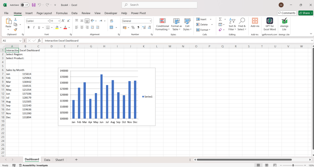


Dashboard Elements:
Dropdown filters: Region and Product.
Sales Chart: Monthly sales performance.
Summary Metrics: Total Sales and Best Month.
Each time you select a different region or product and rerun the Python function, the entire chart and summary will refresh automatically!
Optional Enhancement
To make the dashboard refresh automatically (without rerunning the Python script), you can integrate xlwings’ RunPython functionality directly into Excel’s buttons.
Simply install the xlwings Excel Add-in (xlwings addin install), create a button in Excel, and assign the refresh_dashboard Python function to it. Then, you’ll have a truly self-contained, clickable dashboard.
Using Python and xlwings together opens up endless possibilities for creating interactive dashboards directly inside Excel — blending the automation power of Python with the familiarity of Excel’s interface.
This approach is ideal for analysts and business professionals who want live, Python-driven insights without leaving Excel.


Leave a Reply