As someone new to web development, embarking on the journey of building a straightforward yet adaptable website can be both thrilling and enlightening. It serves as an excellent opportunity to grasp the fundamentals of HTML and CSS, delving into the practical aspects of website creation and design.
Within this blog post, I aim to lead you through the creation of an appealing and responsive coffee-themed website using HTML and CSS. While the focus will be on a coffee theme, feel free to personalize it according to your preferences. Through this hands-on project, you’ll not only acquire the skills to construct a website but also understand the importance of structuring web content correctly and implementing styles to ensure responsiveness across various screen sizes.
Our coffee website will rely on standard HTML elements such as header, navigation bar (nav), ul, li, a, and button, coupled with fundamental CSS properties to add style and responsiveness. These steps are designed to be beginner-friendly, ensuring that you can easily follow along and comprehend the code explanations.
Guidelines for Crafting a Responsive Coffee Website using HTML and CSS
Follow these straightforward, step-by-step instructions to develop a responsive coffee website employing HTML and CSS:
Create a Folder:
Begin by establishing a folder with a name of your choice. This folder will house all the necessary files for your project.
Main HTML File:
Generate a file named index.html to act as the primary file for your website. This file will serve as the entry point for your project.
CSS Styling File:
Craft a file named style.css to contain all the CSS code responsible for styling your website. This file will be crucial for achieving the desired visual appearance.
HTML Markup:
Start by incorporating the following HTML code into your index.html file. This code comprises essential HTML markup, utilizing semantic tags such as header, nav, h2, a, ul, li, p, and button. These tags play a vital role in shaping the overall layout of your website. Additionally, a few lines of JavaScript code are included to facilitate the toggling of the mobile menu on smaller screens.
<!DOCTYPE html>
<!-- Coding By CodeMagnet - www.codemagnet.in -->
<html lang="en">
<head>
<meta charset="UTF-8">
<meta name="viewport" content="width=device-width, initial-scale=1.0">
<title>Coffee Website HTML and CSS</title>
<link rel="stylesheet" href="styl.css">
<!-- Google Fonts Links For Icon -->
<link rel="stylesheet" href="https://fonts.googleapis.com/css2?family=Material+Symbols+Outlined:opsz,wght,FILL,GRAD@24,400,0,0">
</head>
<body>
<header>
<nav class="navbar">
<a class="logo" href="#">Coffee<span>.</span></a>
<ul class="menu-links">
<span id="close-menu-btn" class="material-symbols-outlined">close</span>
<li><a href="#">Home</a></li>
<li><a href="#">Hand Picked Products</a></li>
<li><a href="#">Buy a Sample</a></li>
<li><a href="#">About us</a></li>
<li><a href="#">Contact us</a></li>
</ul>
<span id="hamburger-btn" class="material-symbols-outlined">menu</span>
</nav>
</header>
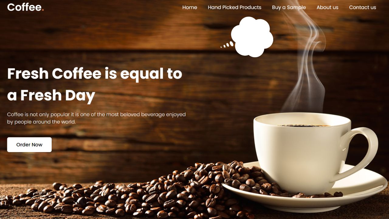
<section class="hero-section">
<div class="content">
<h2>Fresh Coffee is equal to a Fresh Day</h2>
<p>
Coffee is not only popular it is one of the most beloved beverage enjoyed by
people around the world.
</p>
<button>Order Now</button>
</div>
</section>
<script>
const header = document.querySelector("header");
const hamburgerBtn = document.querySelector("#hamburger-btn");
const closeMenuBtn = document.querySelector("#close-menu-btn");
// Toggle mobile menu on hamburger button click
hamburgerBtn.addEventListener("click", () => header.classList.toggle("show-mobile-menu"));
// Close mobile menu on close button click
closeMenuBtn.addEventListener("click", () => hamburgerBtn.click());
</script>
</body>
</html>Proceed by integrating the subsequent CSS code into your style.css file to impart style and responsiveness to your coffee website, enhancing its visual appeal. Don’t hesitate to explore various CSS properties, including colors, fonts, and backgrounds, allowing you to infuse your unique flair and elevate the overall beauty of the website.
/* Importing Google font - Poppins */

@import url('https://fonts.googleapis.com/css2?family=Poppins:wght@300;400;500;600;700&display=swap');


* {

  margin: 0;

  padding: 0;

  box-sizing: border-box;

  font-family: 'Poppins', sans-serif;

}


header {

  position: fixed;

  top: 0;

  left: 0;

  width: 100%;

  padding: 20px;

}


header .navbar {

  display: flex;

  align-items: center;

  justify-content: space-between;

  max-width: 1200px;

  margin: 0 auto;

}


.navbar .logo {

  color: #fff;

  font-weight: 600;

  font-size: 2.1rem;

  text-decoration: none;

}


.navbar .logo span {

  color: #C06B3E;

}


.navbar .menu-links {

  display: flex;

  list-style: none;

  gap: 35px;

}


.navbar a {

  color: #fff;

  text-decoration: none;

  transition: 0.2s ease;

}


.navbar a:hover {

  color: #C06B3E;

}


.hero-section {

  height: 100vh;

  background-image: url("https://imagetolink.com/ib/XNlZdsxBZ8.jpg");

  background-position: center;

  background-size: cover;

  display: flex;

  align-items: center;

  padding: 0 20px;

}


.hero-section .content {

  max-width: 1200px;

  margin: 0 auto;

  width: 100%;

  color: #fff;

}


.hero-section .content h2 {

  font-size: 3rem;

  max-width: 600px;

  line-height: 70px;

}


.hero-section .content p {

  font-weight: 300;

  max-width: 600px;

  margin-top: 15px;

}


.hero-section .content button {

  background: #fff;

  padding: 12px 30px;

  border: none;

  font-size: 1rem;

  border-radius: 6px;

  margin-top: 38px;

  cursor: pointer;

  font-weight: 500;

  transition: 0.2s ease;

}


.hero-section .content button:hover {

  color: #fff;

  background: #C06B3E;

}


#close-menu-btn {

  position: absolute;

  right: 20px;

  top: 20px;

  cursor: pointer;

  display: none;

}


#hamburger-btn {

  color: #fff;

  cursor: pointer;

  display: none;

}


@media (max-width: 768px) {

  header {

    padding: 10px;

  }


  header.show-mobile-menu::before {

    content: "";

    position: fixed;

    left: 0;

    top: 0;

    width: 100%;

    height: 100%;

    backdrop-filter: blur(5px);

  }


  .navbar .logo {

    font-size: 1.7rem;

  }


  #hamburger-btn, #close-menu-btn {

    display: block;

  }


  .navbar .menu-links {

    position: fixed;

    top: 0;

    left: -250px;

    width: 250px;

    height: 100vh;

    background: #fff;

    flex-direction: column;

    padding: 70px 40px 0;

    transition: left 0.2s ease;

  }


  header.show-mobile-menu .navbar .menu-links {

    left: 0;

  }


  .navbar a {

    color: #000;

  }


  .hero-section .content {

    text-align: center;

  }


  .hero-section .content :is(h2, p) {

    max-width: 100%;

  }


  .hero-section .content h2 {

    font-size: 2.3rem;

    line-height: 60px;

  }


  .hero-section .content button {

    padding: 9px 18px;

  }

}
Conclusion:
To sum up, crafting a responsive website stands as a valuable and gratifying endeavor, especially for those venturing into the realm of web development. I am confident that, by adhering to the steps and code provided in this post, you have effectively built your responsive coffee website utilizing HTML and CSS.
Output


Leave a Reply