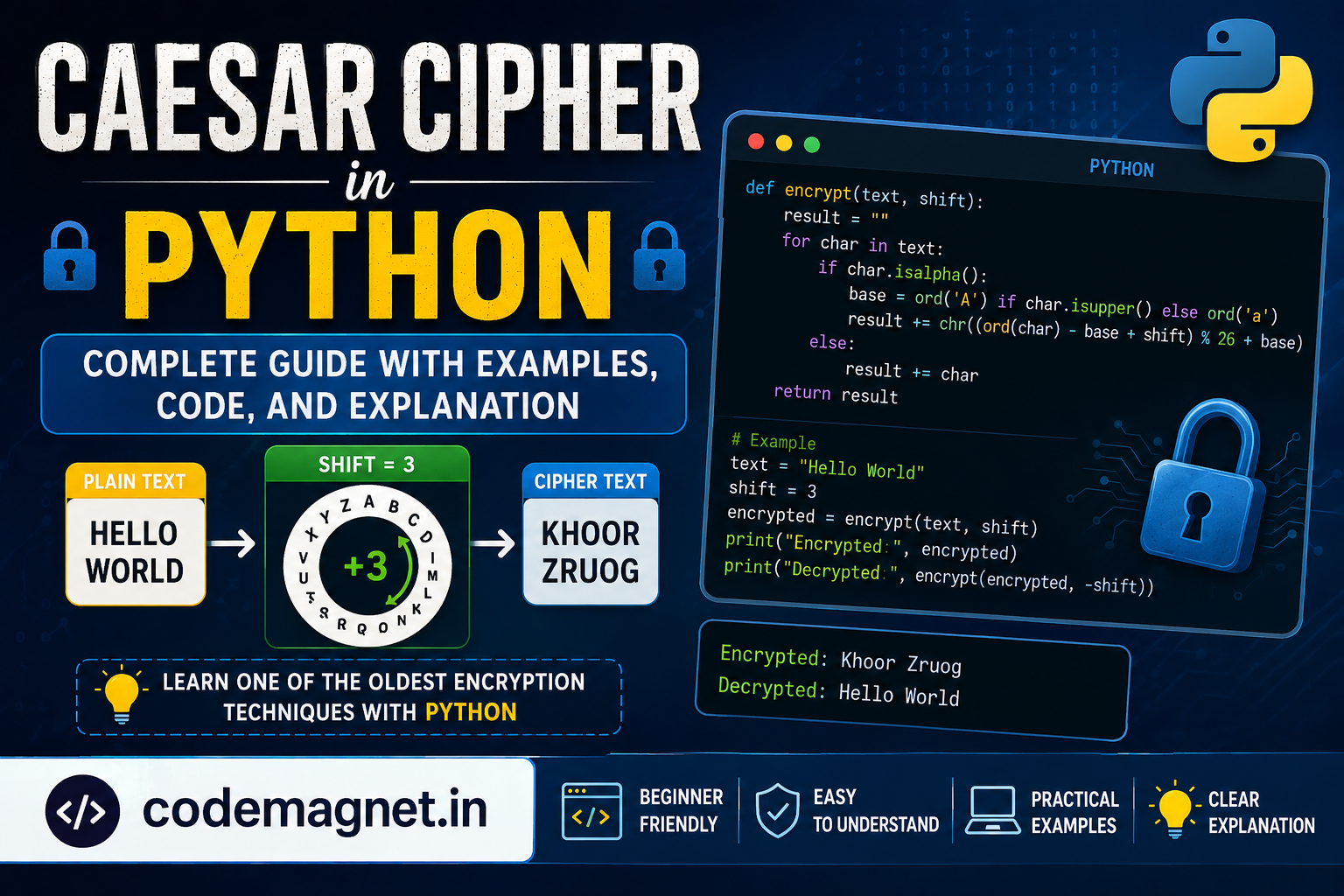
CSS, or Cascading Style Sheets, is a powerful language used for making websites and apps look good and work smoothly. It helps create various movements and style changes on webpages. Let me explain how to add a 3d layer hover effect on social media buttons which you can add it in your website as well.

what are CSS animations and transitions? These are like magic tricks for web elements – they transform when the webpage loads or when you interact with them (like hovering or clicking). Some changes might happen quickly, while others might take a bit longer. It’s all about making your webpage look cooler and more engaging!
Social Media Buttons – 3D Layer CSS Animation
First, create an HTML file with the name of codin.html(you can take any name) and paste the given codes in your HTML file. Remember, you’ve to create a file with .html extension.
<!DOCTYPE html>

<!-- CodeMagnet -->

<html lang="en" dir="ltr">

   <head>

      <meta charset="utf-8">

      <title>CodeMagnet</title>

      <link rel="stylesheet" href="st.css">

      <link rel="stylesheet" href="https://cdnjs.cloudflare.com/ajax/libs/font-awesome/5.15.3/css/all.min.css"/>

   </head>

   <body>

      <div class="icons">

         <a href="#">

            <div class="layer">

               <span></span>

               <span></span>

               <span></span>

               <span></span>

               <span class="fab fa-facebook-f"></span>

            </div>

            <div class="text">

               Facebook

            </div>

         </a>

         <a href="#">

            <div class="layer">

               <span></span>

               <span></span>

               <span></span>

               <span></span>

               <span class="fab fa-twitter"></span>

            </div>

            <div class="text">

               Twitter

            </div>

         </a>

         <a href="#">

            <div class="layer">

               <span></span>

               <span></span>

               <span></span>

               <span></span>

               <span class="fab fa-instagram"></span>

            </div>

            <div class="text">

               Instagram

            </div>

         </a>

         <a href="#">

            <div class="layer">

               <span></span>

               <span></span>

               <span></span>

               <span></span>

               <span class="fab fa-linkedin-in"></span>

            </div>

            <div class="text">

               Linkedin

            </div>

         </a>

         <a href="#">

            <div class="layer">

               <span></span>

               <span></span>

               <span></span>

               <span></span>

               <span class="fab fa-youtube"></span>

            </div>

            <div class="text">

               YouTube

            </div>

         </a>

      </div>

   </body>

</html>
Let’s understand the above code by breaking it down:
<!DOCTYPE html>: Declaration of the HTML document type.<!-- CodeMagnet -->: HTML comment indicating the name or identifier of the code.<html lang="en" dir="ltr">: Opening tag for the HTML document with language set to English and direction set to left-to-right.<head>: Opening tag for the head section, which contains meta-information about the HTML document.<meta charset="utf-8">: Meta tag specifying the character encoding as UTF-8.<title>CodeMagnet</title>: Title tag specifying the title of the HTML document as “CodeMagnet.”<link rel="stylesheet" href="st.css">: Link tag to include an external CSS file named “st.css.”<link rel="stylesheet" href="https://cdnjs.cloudflare.com/ajax/libs/font-awesome/5.15.3/css/all.min.css"/>: Link tag to include Font Awesome CSS from a CDN.<body>: Opening tag for the body section, which contains the content of the HTML document.<div class="icons">: A div element with the class “icons” to group the social media icons.- Social media icons section (Facebook, Twitter, Instagram, Linkedin, YouTube):
<a href="#">: Anchor tag defining a hyperlink (with a placeholder “#”).<div class="layer">: A div with the class “layer” containing spans for a layered effect.<span></span>: Empty span elements for the layered effect.<span class="fab fa-facebook-f"></span>: A span for the Font Awesome Facebook icon.<div class="text">: A div with the class “text” containing the name of the social media platform.</a>: Closing tag for the anchor element.
The structure repeats for each social media icon. It creates a set of linked icons with a layered effect and associated text.
Second, create a CSS file with the name of st.css(you can take your own name make sure you change it in html file) and paste the given codes in your CSS file. Remember, you’ve to create a file with .css extension.
@import url('https://fonts.googleapis.com/css?family=Poppins:400,500,600,700&display=swap');

*{

  margin: 0;

  padding: 0;

  box-sizing: border-box;

  font-family: 'Poppins', sans-serif;

}

html,body{

  display: grid;

  height: 100%;

  place-items: center;

  background: #000;

}

.icons{

  display: inline-flex;

}

.icons a{

  margin: 0 25px;

  text-decoration: none;

  color: #fff;

  display: block;

  position: relative;

}

.icons a .layer{

  width: 55px;

  height: 55px;

  transition: transform 0.3s;

}

.icons a:hover .layer{

  transform: rotate(-35deg) skew(20deg);

}

.icons a .layer span{

  position: absolute;

  top: 0;

  left: 0;

  height: 100%;

  width: 100%;

  border: 1px solid #fff;

  border-radius: 5px;

  transition: all 0.3s;

}

.icons a .layer span.fab{

  font-size: 30px;

  line-height: 55px;

  text-align: center;

}

.icons a:hover .layer span:nth-child(1){

  opacity: 0.2;

}

.icons a:hover .layer span:nth-child(2){

  opacity: 0.4;

  transform: translate(5px, -5px);

}

.icons a:hover .layer span:nth-child(3){

  opacity: 0.6;

  transform: translate(10px, -10px);

}

.icons a:hover .layer span:nth-child(4){

  opacity: 0.8;

  transform: translate(15px, -15px);

}

.icons a:hover .layer span:nth-child(5){

  opacity: 1;

  transform: translate(20px, -20px);

}

.icons a:nth-child(1) .layer span,

.icons a:nth-child(1) .text{

  color: #4267B2;

  border-color: #4267B2;

}

.icons a:nth-child(2) .layer span,

.icons a:nth-child(2) .text{

  color: #1DA1F2;

  border-color: #1DA1F2;

}

.icons a:nth-child(3) .layer span,

.icons a:nth-child(3) .text{

  color: #E1306C;

  border-color: #E1306C;

}

.icons a:nth-child(4) .layer span,

.icons a:nth-child(4) .text{

  color: #2867B2;

  border-color: #2867B2;

}

.icons a:nth-child(5) .layer span,

.icons a:nth-child(5) .text{

  color: #ff0000;

  border-color: #ff0000;

}

.icons a:hover:nth-child(1) .layer span{

  box-shadow: -1px 1px 3px #4267B2;

}

.icons a:hover:nth-child(2) .layer span{

  box-shadow: -1px 1px 3px #1DA1F2;

}

.icons a:hover:nth-child(3) .layer span{

  box-shadow: -1px 1px 3px #E1306C;

}

.icons a:hover:nth-child(4) .layer span{

  box-shadow: -1px 1px 3px #2867B2;

}

.icons a:hover:nth-child(5) .layer span{

  box-shadow: -1px 1px 3px #ff0000;

}

.icons a .text{

  position: absolute;

  left: 50%;

  bottom: -5px;

  opacity: 0;

  font-weight: 500;

  transform: translateX(-50%);

  transition: bottom 0.3s ease, opacity 0.3s ease;

}

.icons a:hover .text{

  bottom: -35px;

  opacity: 1;

}
Let’s understand the above code in detail:
@import url('https://fonts.googleapis.com/css?family=Poppins:400,500,600,700&display=swap');
This line imports the ‘Poppins’ font from Google Fonts and includes different font weights.
*{

  margin: 0;

  padding: 0;

  box-sizing: border-box;

  font-family: 'Poppins', sans-serif;

}
above code Resets margin and padding for all elements to zero, sets the box-sizing model to border-box, and applies the ‘Poppins’ font to the entire document.
html,body{

  display: grid;

  height: 100%;

  place-items: center;

  background: #000;

}
above code Centers the content of the HTML and body elements on the grid, sets the height to 100%, and gives a black background.
.icons{

  display: inline-flex;

}
above code Sets the display of the icons class to inline-flex to create a horizontal row of icons.
.icons a{

  margin: 0 25px;

  text-decoration: none;

  color: #fff;

  display: block;

  position: relative;

}
above code defines the styles for each icon link, including margin, no text decoration, white color, block display, and relative positioning.
.icons a .layer{

  width: 55px;

  height: 55px;

  transition: transform 0.3s;

}
above set of code Sets the size and transition effect for the layer of each icon.
.icons a:hover .layer{

  transform: rotate(-35deg) skew(20deg);

}
above code
- Applies a transformation to the layer when the icon is hovered.
The subsequent lines of code define styles for the icon layers, including spans, font size, colors, shadows, and transitions. These styles create a dynamic and interactive effect when hovering over the icons.
The last part of the code deals with the text associated with each icon, adjusting its position, opacity, and transition effects when hovered.
Hope you enjoyed your output, feel free to copy the code and make changes. Happy Coding !


Leave a Reply