
Unlock Excel Automation. Python is an incredibly powerful tool for data analysis and visualization, and it can extend the capabilities of Excel significantly.
Unlock Excel Automation: While Excel is widely used for data manipulation, its charting capabilities are somewhat limited when compared to Python’s powerful libraries, such as Matplotlib and Seaborn.
In this article, we’ll explore how to use Python to create a violin plot from the famous Iris dataset and enhance the visualization experience in Excel.
The Iris dataset is one of the most popular datasets used for machine learning and data visualization, consisting of 150 samples of iris flowers, each described by four features: sepal length, sepal width, petal length, and petal width. We will use Python to create a violin plot from this dataset to visually compare the distributions of these features.
What Is a Violin Plot?
A violin plot combines the benefits of a box plot and a kernel density plot. It provides a summary of the distribution of data and is helpful for comparing different groups. The thickness of the violin plot indicates the distribution of the data at various ranges, making it useful for identifying data concentration areas.
Prerequisites
Unlock Excel Automation: Before diving into the code, ensure that you have Python installed along with the following libraries:
- Pandas: For data manipulation.
- Seaborn: For creating violin plots.
- Matplotlib: For plotting and visualization.
- OpenPyXL or XlsxWriter: For exporting the plot to Excel.
To install these libraries, use the following pip command:
pip install pandas seaborn matplotlib openpyxl
Step 1: Loading the Iris Dataset
We will first load the Iris dataset using the Pandas library. The dataset is available as part of Seaborn’s built-in datasets, making it easy to load.
import seaborn as sns
import pandas as pd

# Load the iris dataset from seaborn
iris = sns.load_dataset('iris')

# Display the first few rows of the dataset
print(iris.head())
Output:

This dataset contains 150 rows and 5 columns, including the species of the iris flowers (setosa, versicolor, and virginica) and their respective sepal and petal dimensions. The iris.head() command prints the first five rows of the dataset.
Step 2: Creating the Violin Plot
To create a violin plot, we’ll use Seaborn, which is built on top of Matplotlib and provides a simple interface for complex visualizations. Our goal is to compare the distribution of features across the three species.
Here’s the code to create a violin plot:
import seaborn as sns
import matplotlib.pyplot as plt
# Load the iris dataset from seaborn
iris = sns.load_dataset('iris')
# Set the style for the plot
sns.set(style="whitegrid")
# Create a violin plot for the sepal length feature, grouped by species
plt.figure(figsize=(8, 6))
sns.violinplot(x="species", y="sepal_length", data=iris)
# Add labels and title
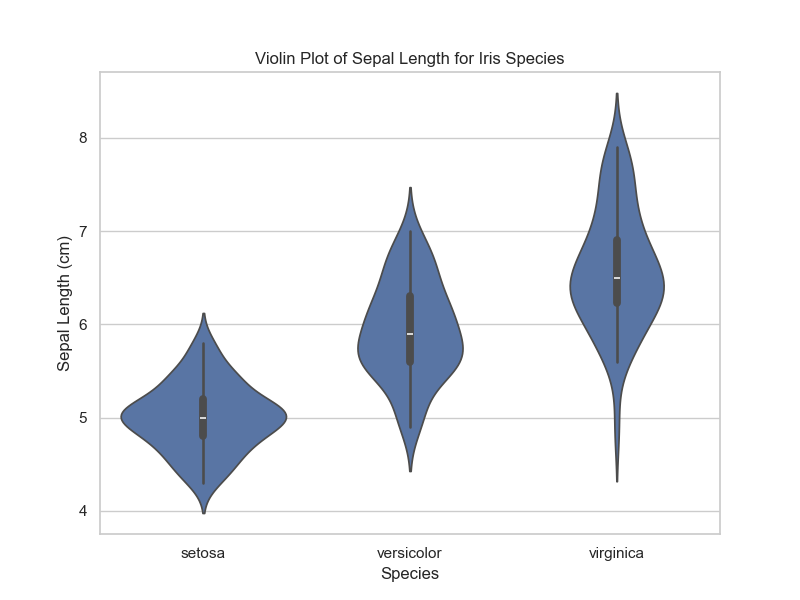
plt.title('Violin Plot of Sepal Length for Iris Species')
plt.xlabel('Species')
plt.ylabel('Sepal Length (cm)')
# Show the plot
plt.show()
Output:
Explanation:
sns.violinplot(): This function creates the violin plot. We specifyspecieson the x-axis andsepal_lengthon the y-axis to compare the sepal lengths of the three iris species.plt.figure(figsize=(8, 6)): This sets the figure size to make the plot larger and clearer.plt.title(),plt.xlabel(),plt.ylabel(): These methods add titles and labels to the plot.
The resulting violin plot provides a visual comparison of the distribution of sepal lengths across different species. The width of each violin represents the data’s density at different values of sepal length.
Step 3: Exporting the Violin Plot to Excel
Now that we have the plot, let’s export it to an Excel file. To do this, we’ll use the OpenPyXL or XlsxWriter library, which allows for writing data and images into Excel files.
Here’s how to export the violin plot to Excel:
import matplotlib.pyplot as plt  # Importing plt for saving the plot
import seaborn as sns  # Import seaborn for creating the plot
import openpyxl
from openpyxl.drawing.image import Image

# Load the iris dataset from seaborn
iris = sns.load_dataset('iris')

# Create the plot (this is where the plot is actually generated)
plt.figure(figsize=(8, 6))
sns.violinplot(x="species", y="sepal_length", data=iris)

# Save the plot as an image file
plot_filename = 'violin_plot.png'
plt.savefig(plot_filename)

# Create a new Excel workbook and sheet
excel_filename = 'iris_violin_plot.xlsx'
wb = openpyxl.Workbook()
ws = wb.active
ws.title = "Violin Plot"

# Add the image to the Excel sheet
img = Image(plot_filename)
ws.add_image(img, 'A1')

# Save the workbook
wb.save(excel_filename)

print(f"Violin plot saved to {excel_filename}")
Output:
By running this code, the violin plot is exported to an Excel file (iris_violin_plot.xlsx), where it can be viewed and shared with others.
Step 4: Enhancing the Violin Plot with Multiple Features
You can further enhance the visualization by creating violin plots for multiple features at once. For example, we can create violin plots for both sepal length and sepal width, comparing them across species.
import matplotlib.pyplot as plt  # Importing plt for saving the plot
import seaborn as sns  # Import seaborn for creating the plot
import openpyxl
from openpyxl.drawing.image import Image

# Load the iris dataset from seaborn
iris = sns.load_dataset('iris')

# Create the violin plot for sepal length and save as an image
plt.figure(figsize=(8, 6))
sns.violinplot(x="species", y="sepal_length", data=iris)

# Save the plot as an image file
plot_filename = 'violin_plot.png'
plt.savefig(plot_filename)

# Create a new Excel workbook and sheet
excel_filename = 'iris_violin_plot.xlsx'
wb = openpyxl.Workbook()
ws = wb.active
ws.title = "Violin Plot"

# Add the image to the Excel sheet
img = Image(plot_filename)
ws.add_image(img, 'A1')

# Create a figure with two subplots for sepal length and sepal width
plt.figure(figsize=(10, 6))

# First subplot: violin plot for sepal length
plt.subplot(1, 2, 1)
sns.violinplot(x="species", y="sepal_length", data=iris)
plt.title('Sepal Length by Species')

# Second subplot: violin plot for sepal width
plt.subplot(1, 2, 2)
sns.violinplot(x="species", y="sepal_width", data=iris)
plt.title('Sepal Width by Species')

# Show the plot
plt.tight_layout()
plt.show()

# Save the workbook with the image
wb.save(excel_filename)

# Confirmation message
print(f"Violin plot saved to {excel_filename}")
Output:

Conclusion
In this article, we explored how to enhance Excel with Python by creating a violin plot from the Iris dataset. We covered:
- Loading and inspecting the Iris dataset using Pandas and Seaborn.
- Creating a basic violin plot to visualize the distribution of a feature (sepal length) across different species.
- Exporting the violin plot to Excel using the OpenPyXL library.
- Enhancing the violin plot by comparing multiple features (sepal length and sepal width) side by side.
Using Python to create advanced plots like violin plots offers more flexibility and control compared to Excel’s native charting options. With libraries like Seaborn, Matplotlib, and OpenPyXL, you can generate beautiful, informative plots and seamlessly integrate them into your Excel reports.
By mastering these tools, you can supercharge your data visualization workflow, combining the ease of Excel with the power of Python for more complex and detailed analysis.


Leave a Reply