Interactive and aesthetically pleasing buttons are a key element in web design, and adding subtle effects can elevate the user experience. In this article, we will walk through the process of creating an innovative voice button that features a glowing light effect using only HTML and CSS. This button design can be used for voice commands or interactive web applications that require a modern UI.
By the end of this guide, you’ll have a voice button that glows when hovered, clicks, or is in its idle state, providing an engaging effect that mimics voice activation interfaces.
Step 1: Structuring the HTML
We’ll start by writing the basic HTML structure for our button. The button will be wrapped in a <div> container for better positioning and styling. Let’s keep it simple:
<!DOCTYPE html>
<html lang="en">
<head>
    <meta charset="UTF-8">
    <meta name="viewport" content="width=device-width, initial-scale=1.0">
    <title>Voice Button with Light Glow</title>
    <link rel="stylesheet" href="styles.css">
</head>
<body>
    <div class="button-container">
        <button class="voice-button">
            <i class="fas fa-microphone"></i> Voice Command
        </button>
    </div>
</body>
</html>
Explanation:
- The
divelement with the classbutton-containerhelps in positioning the button on the page. - The
buttonelement has a classvoice-buttonand contains an icon (fa-microphone) representing a microphone, which symbolizes voice commands. This icon is from Font Awesome, a popular icon library. - You need to include Font Awesome in your project by adding the following line inside the
<head>section:
<link rel="stylesheet" href="https://cdnjs.cloudflare.com/ajax/libs/font-awesome/6.0.0-beta3/css/all.min.css">
Step 2: Styling the Button with CSS
Next, we’ll move on to the CSS styling, which will add the glowing light effect. The glow will occur when the button is idle, hovered, or clicked. Here’s how we’ll structure the CSS:
/* General styles */
body {
    display: flex;
    justify-content: center;
    align-items: center;
    height: 100vh;
    background-color: #121212;
    margin: 0;
    font-family: Arial, sans-serif;
}

.button-container {
    position: relative;
}

.voice-button {
    background-color: #1e1e1e;
    border: 2px solid #00ffcc;
    color: #fff;
    padding: 15px 40px;
    font-size: 18px;
    border-radius: 50px;
    cursor: pointer;
    transition: all 0.3s ease;
    position: relative;
    overflow: hidden;
    box-shadow: 0 0 20px rgba(0, 255, 204, 0.5);
}

/* Glowing effect */
.voice-button::before {
    content: '';
    position: absolute;
    top: 0;
    left: 0;
    right: 0;
    bottom: 0;
    border-radius: 50px;
    background: linear-gradient(45deg, rgba(0, 255, 204, 0.8), rgba(0, 136, 204, 0.6));
    z-index: -1;
    transition: opacity 0.4s ease;
    opacity: 0;
}

.voice-button:hover::before,
.voice-button:active::before {
    opacity: 1;
    box-shadow: 0 0 30px rgba(0, 255, 204, 0.9);
}

.voice-button i {
    margin-right: 10px;
}

/* Button hover and active states */
.voice-button:hover {
    transform: translateY(-5px);
    box-shadow: 0 0 25px rgba(0, 255, 204, 0.8), 0 0 50px rgba(0, 136, 204, 0.4);
}

.voice-button:active {
    transform: scale(0.95);
    box-shadow: 0 0 10px rgba(0, 255, 204, 0.6);
}
Explanation of CSS:
- The body uses flexbox to center the button vertically and horizontally on the page. The background color is set to a dark shade (#121212), making the glowing effect stand out.
- The
.voice-buttonclass styles the button itself. It features a rounded design with a glowing shadow that creates the “light glow” effect.border-radius: 50px;makes the button edges rounded.box-shadow: 0 0 20px rgba(0, 255, 204, 0.5);adds a subtle initial glow to the button.- The
::beforepseudo-element is used to add the animated glow effect. It uses a linear-gradient to give a smooth, glowing light effect. - The button transitions smoothly when hovered (
.voice-button:hover) or clicked (.voice-button:active), enhancing the user experience with transformations.
- On hover, the button moves slightly up (
transform: translateY(-5px);) and the glow intensifies. - When the button is active (clicked), the button scales down (
transform: scale(0.95);) to give a pressing effect.
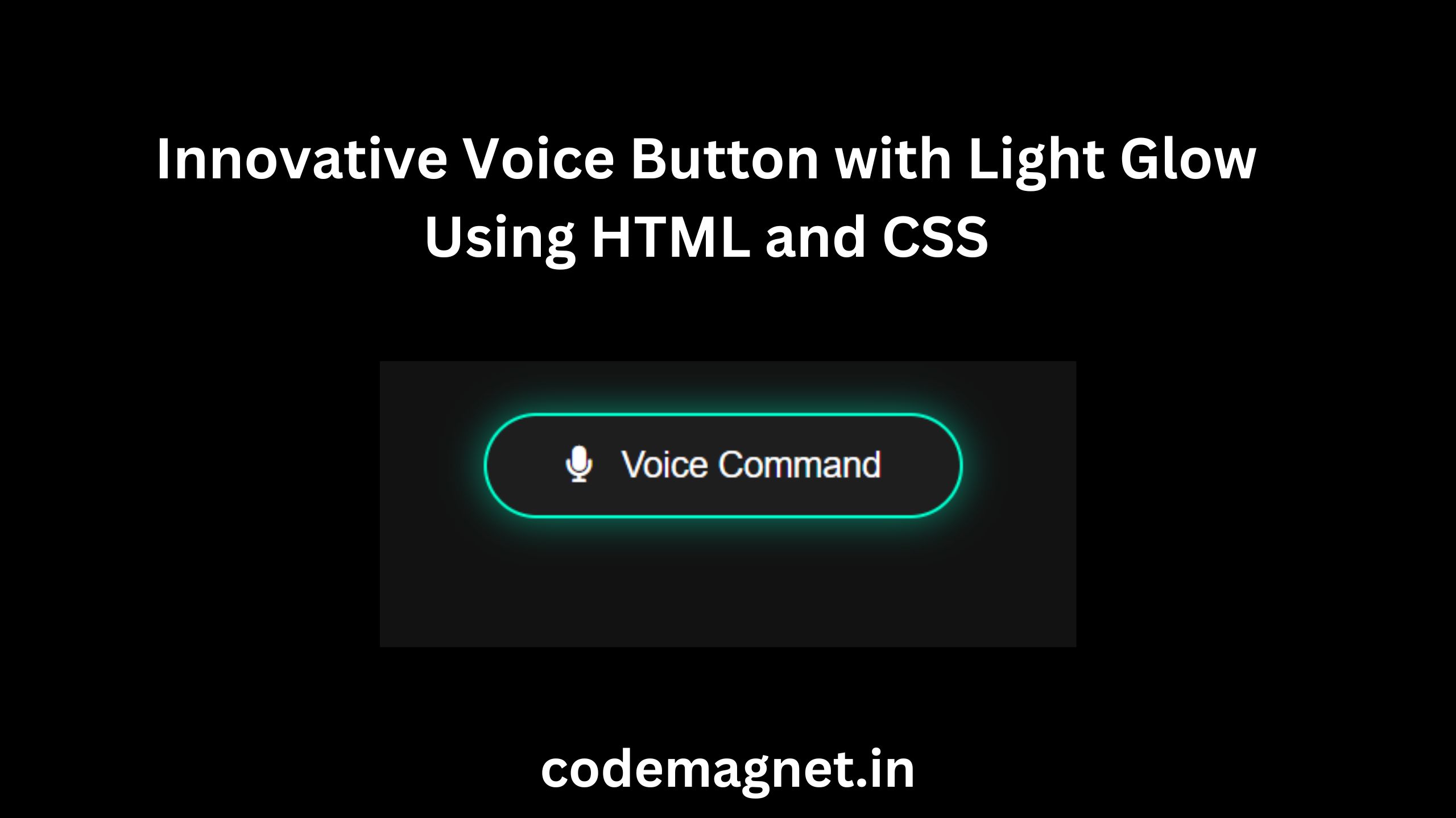
Step 3: Final Output
When you run the code, you’ll see a voice button with a glowing effect. As you hover over it, the glow becomes more intense, and when you click it, the button subtly shrinks, mimicking a button press.
CSS Breakdown for the Glowing Effect:
box-shadow: Creates the glowing halo around the button. The intensity changes during hover and click events to create interactivity.::beforepseudo-element: This hidden layer uses a gradient and becomes visible on hover or click, adding more depth to the glowing effect.transition: Smooth transitions ensure that the glow and button movements feel natural and fluid.
Full Source Code:
<!DOCTYPE html>
<html lang="en">
<head>
    <meta charset="UTF-8">
    <meta name="viewport" content="width=device-width, initial-scale=1.0">
    <title>Voice Button with Light Glow</title>
    <link rel="stylesheet" href="voice.css">
    <link rel="stylesheet" href="https://cdnjs.cloudflare.com/ajax/libs/font-awesome/6.0.0-beta3/css/all.min.css">

</head>
<body>
    <div class="button-container">
        <button class="voice-button">
            <i class="fas fa-microphone"></i> Voice Command
        </button>
    </div>
</body>
</html>
Note: do not forget to change/add your css file name here inside head tag
Output:

Enhancing the Button with Voice Interaction (Optional)
Although this article focuses on the design of the button, you can enhance it by adding JavaScript to enable actual voice recognition using the Web Speech API. Here’s a basic example:
<script>
    const button = document.querySelector('.voice-button');

    button.addEventListener('click', () => {
        const recognition = new (window.SpeechRecognition || window.webkitSpeechRecognition)();

        recognition.onstart = function() {
            console.log('Voice recognition started');
        };

        recognition.onresult = function(event) {
            const spokenText = event.results[0][0].transcript;
            alert('You said: ' + spokenText);
        };

        recognition.start();
    });
</script>
Full Code:
<!DOCTYPE html>
<html lang="en">
<head>
    <meta charset="UTF-8">
    <meta name="viewport" content="width=device-width, initial-scale=1.0">
    <title>Voice Button with Light Glow</title>
    <link rel="stylesheet" href="voice.css">
    <link rel="stylesheet" href="https://cdnjs.cloudflare.com/ajax/libs/font-awesome/6.0.0-beta3/css/all.min.css">

</head>
<body>
    <div class="button-container">
        <button class="voice-button">
            <i class="fas fa-microphone"></i> Voice Command
        </button>
    </div>
</body>
<script>
    const button = document.querySelector('.voice-button');

    button.addEventListener('click', () => {
        const recognition = new (window.SpeechRecognition || window.webkitSpeechRecognition)();

        recognition.onstart = function() {
            console.log('Voice recognition started');
        };

        recognition.onresult = function(event) {
            const spokenText = event.results[0][0].transcript;
            alert('You said: ' + spokenText);
        };

        recognition.start();
    });
</script>

</html>
Output:
Explanation:
- The SpeechRecognition API listens for voice input once the button is clicked.
- The result of the speech is captured and displayed in an alert box.
Conclusion
Designing an innovative voice button with a glowing light effect is an excellent way to add both style and functionality to modern web applications. This type of button not only looks visually appealing but also enhances the user experience by providing interactive feedback through animations and effects. By leveraging HTML and CSS, we can craft a button that dynamically responds to user interactions, such as hovering and clicking, creating an engaging and responsive interface.
The glowing light effect serves as a visual cue, drawing attention to the button and subtly guiding users toward its functionality. This kind of design can be particularly useful for voice-enabled services or web applications where audio commands play a central role. It gives users a tactile feel even though they are interacting digitally, with smooth transitions and animations creating a polished, modern aesthetic.
Furthermore, by incorporating JavaScript, we can extend the button’s capabilities to include real voice recognition and interaction. Using the Web Speech API, for example, allows the button to capture voice input from users, making it more than just a visual element—it becomes a functional tool for voice commands. This combination of form and function makes the button not only a design element but also an integral part of the user experience.
Overall, this glowing voice button can serve as a powerful addition to any website or application, especially those focusing on cutting-edge, intuitive user interfaces. By blending CSS animations, HTML structure, and JavaScript functionality, we create a button that is both visually engaging and functionally powerful, offering a seamless and interactive experience for users.


Leave a Reply